
Research
In developing my poster, I decided to do a Prezi on six different feature film posters. I picked a wide range from thrillers to summer blockbusters in order to see how they differ in their approach and style. Equally, I know that there are many codes and conventions that film posters have in common and I intend to make a note of these because they are likely to be institutional requirements.
Planning
After doing some research, I then had a rough idea of what my poster was going to look like. It would feature the characters of Adam and Eve huddled in a corner whilst the hand of Ular would appear with an apple in hand. This would help to evoke a layer of iconography, as the apple is an extremely recognizable symbol due to its use in the biblical story. I drew a rough plan of it in order to get a sense of what it would actually look like. Whilst it was extremely basic, it did help me to understand where to position everything once I had taken the photos and put then into Photoshop.


In the following lesson, we decided to create a basic first draft for the first poster. I decided to use the pictures that I took from the previous day in order to show. Primarily, I was experimenting with all the tools that InDesign had to offer.
In Design is industry standard in creating. I spent a double period learning how to use InDesign. This included changing the ways in which the text looked by adding curves and vectors to it. I also experimented with the title and institutional logos in order to see where they would be placed on my poster. I found this incredibly useful as it allowed me to use a different type of software rather than Photoshop in order to make it look more professional. I also inserted the logos for Facebook and Twitter in order to see where they would ultimately get placed.Whilst it was basic, it will help me when I eventually get round to doing and completing my poster.


Construction
In our lesson, I decided to take pictures for my poster. For this, I positioned the two actors playing Adam and Eve huddled together into a corner. I then had my arm come out of the picture with an apple in hand in order to show off some of the biblical imagery that is present in the film. I have decided to use two pictures however. This is because one of the problems that came as a result of taking the photos was that the camera was only able to focus on either the actors or my hand. It was unable to put both in focus. As a result, I have decided to use two separate pictures and then crop them together into Photoshop to make it look like the same image.
Here are the pictures I used below


After taking these pictures, I found that I disliked the picture on the bottom. This is because the actors feet were cropped out of the picture and I needed their whole bodies in order for the poster to look more realistic. I used the original picture of the arm with the apple but I felt that the retake was necessary. Also, we ended up shooting in a different room which I felt was actually beneficial in the long run. The background felt much more in tone with the dark, impoverished look of the movie compared to the "wavey" curtains used in the first picture.
Here is the retaken picture below.

After
retaking the photos, I started editing in Photoshop. I first cropped the arm of
Ular and inserted it in with the image of Adam and Eve. My poster research helped me in devising where
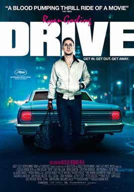
to put each individual piece of text. Drive
was one poster that I always looked back for reference. Through viewing the
poster, I decided that the title would go at the top with the tagline being put
at the side of where the main action in the poster was going. The credits would
go at the very bottom of the poster with the main actor’s names going straight
above it. The production company name would go at the very bottom below the
credits. I decided to pick Warp as my production company since they are an independent
film company and they would likely distribute my film due to its lower status
when compared to movies produced by the “big six”. I also decided to put my social
media logos at the bottom. Whilst few posters actually do this, I decided that
it was still necessary to put it in. I also had to be careful in what font I
choose as it would become difficult to read. I used the font of Mistral Regular
as it was a font that stood out but was a fairly easy and readable font.
How Feedback was vital in my Construction?
Feedback was extremely vital in my construction of the poster. Ultimately, it helped to influence some of the changes that I made. For example, as stated above I had originally planned for my tagline to be towards the side. However, due to comments made by fellow members of my group, I decided to move the title up and place the tagline below. This meant that the main body of the image as well as all the writing would be confined more closer, therefore making it easier for an audience member to visually recognize all the key components displayed within the poster. Other changes that were also suggested by my peers included separating out the social media logos, again so they wouldn't be so confined together. Another aspect that I also made a change was that some of the credits were hard to read, due to the colour of Adam's trainers. As a result, I decided to colour in some of the trainers in grey in order to make the credits a lot more readable. In conclusion, feedback was vital in the construction of my poster as I was able to make small but necessary changes.
I loved this composition with its drama and action: the satanic hand of the villain proffers an apple to the uncertain teenagers who are mesmerized by the scandalously dressed intruder with his showy red fur jacket, skull rings & heavy bracelet. The apple is an instantly recognizable visual code when linked to the word 'Eden' so the viewer instantly knows that it is an evil gesture of temptation - the Disney generation would know the poisoned apple too in Snow White. The layout is dynamic and leads the eye into the centre of the image. It links to the film trailer by featuring the protagonists. The photo quality is pin sharp. All genre conventions are present and based on thorough research (Film title, tagline, principal characters, billing block, release date, social media (all links to actual creations!). Very eye catching and professional.
ReplyDelete